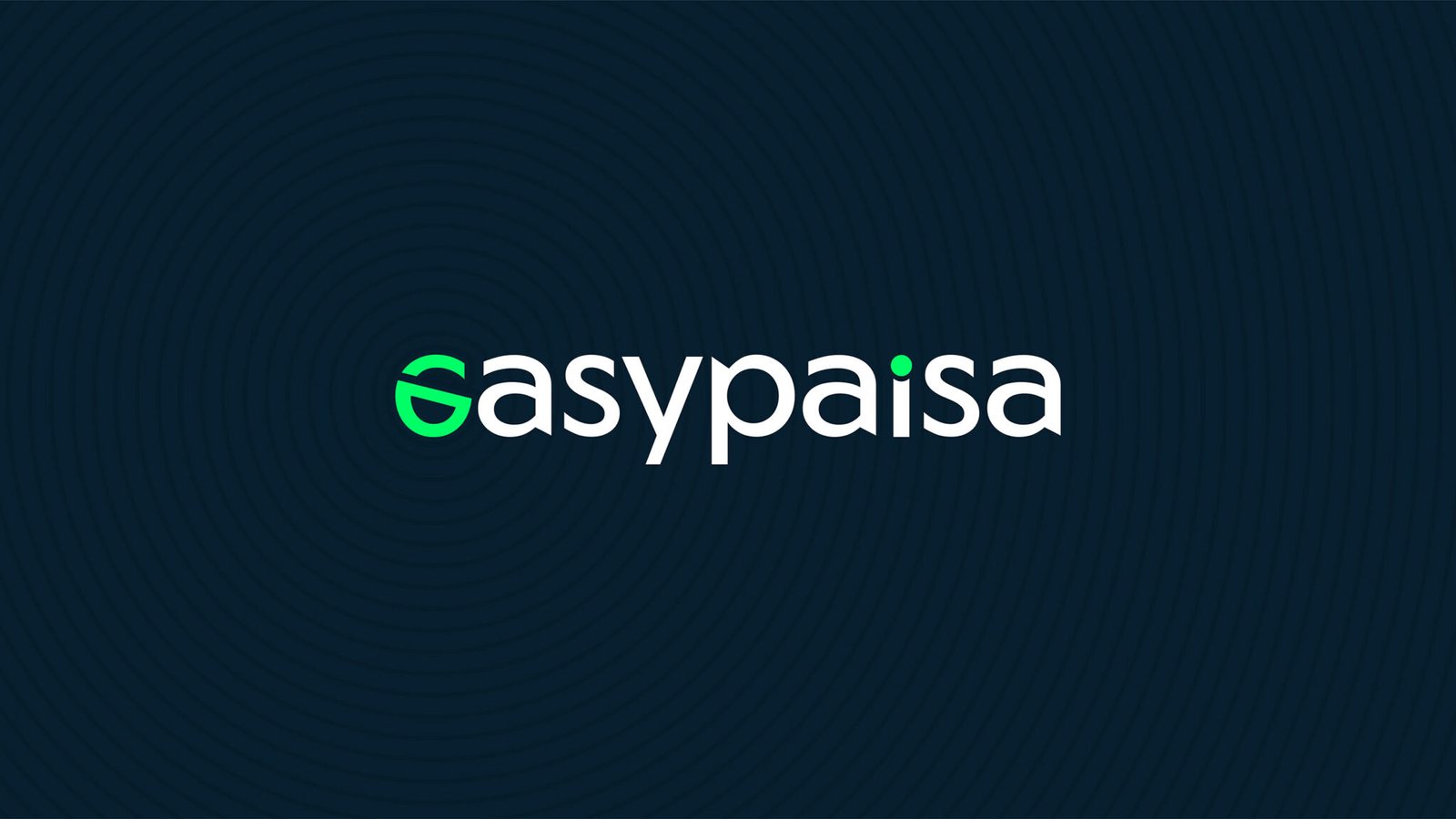
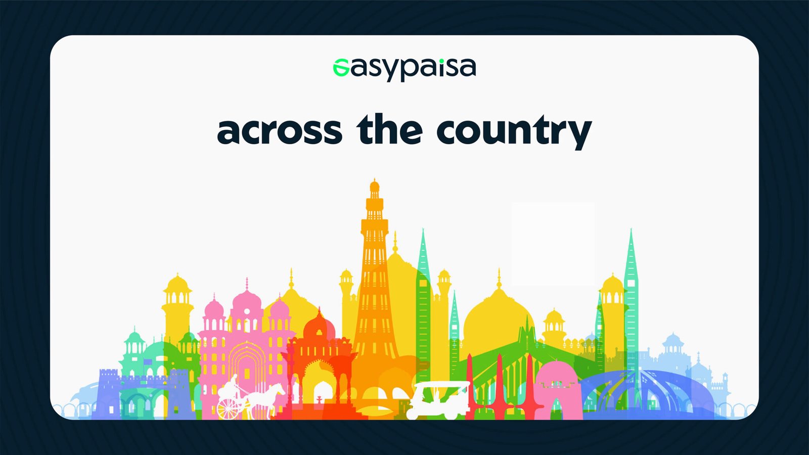
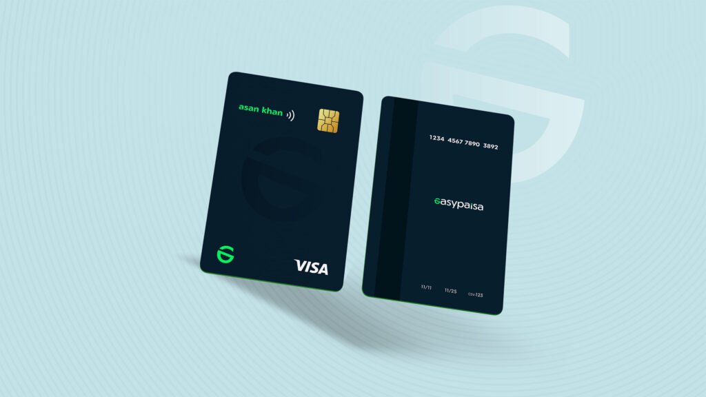
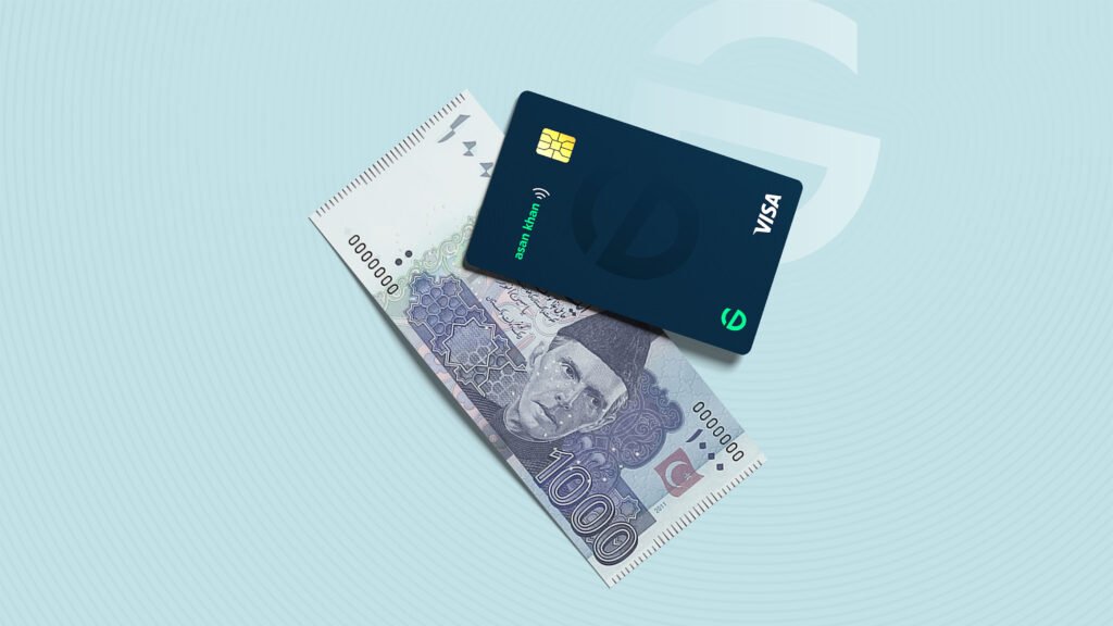
EasyPaisa – Rebranding

Easypaisa is Pakistan’s leading digital payment platform and the country’s first mobile wallet and branchless bank. With over 3 million users, it has transformed the way Pakistanis send, receive, and manage money. From peer-to-peer transfers and bill payments to savings, insurance, and mobile top-ups, Easypaisa empowers millions with fast, secure, and accessible financial services — right from their smartphones. As a pioneer in fintech, Easypaisa continues to lead the charge in financial inclusion and digital banking innovation across the region.

Task

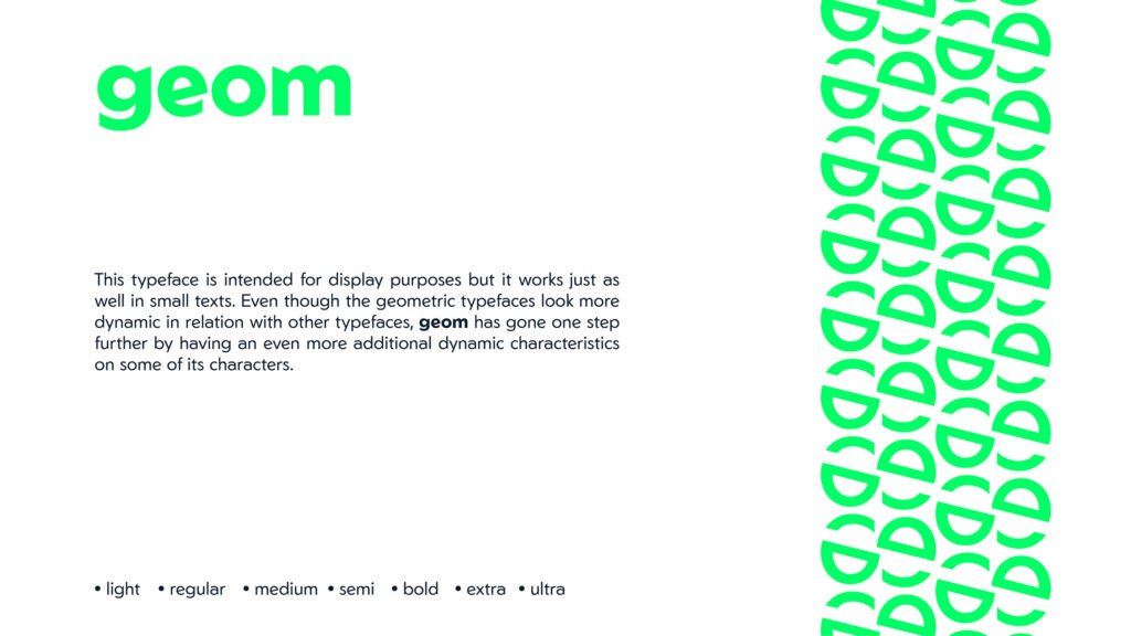
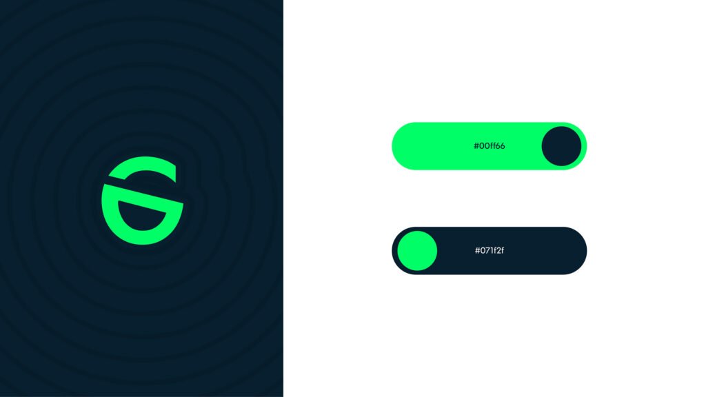
Rebrand Easypaisa with a refreshed logo, color system, and visual identity

  • Strategy

    Brand Strategy,

  • Design

    Rebranding, Logo Redesign, Art Direction

  • Client

    EasyPaisa

THE CHALLENGE

Modernize a well-established brand without losing recognition among millions of daily users.

We evolved the logo with a cleaner, bolder form that feels both digital-first and human-friendly.
The redesigned identity introduces a vibrant green to reinforce trust, innovation, and financial accessibility — aligning with Easypaisa’s role as Pakistan’s leading digital banking platform.

Behind Concept

The redesigned logo for easypaisa, a fintech money transfer company, combines the elements of security and a smile to reflect the company’s commitment to providing a secure and joyful financial experience to its customers.

The logo features a dynamic and modern icon that incorporates two key elements: a lock symbol representing security and a stylized smile symbolizing happiness and satisfaction. The lock symbolizes the company’s dedication to safeguarding its customers’ financial transactions and personal information. It conveys trust, reliability, and protection, assuring users that their money and data are safe and secure with easypaisa.

The smile symbol represents the positive and seamless experience that easypaisa offers to its customers. It embodies the company’s goal of making financial transactions easy, convenient, and delightful, resulting in satisfied and happy customers. The smile also represents the trust and confidence that easypaisa aims to build with its users, ensuring that they feel supported and content with their financial interactions.

The combination of the lock and smile symbols in the redesigned logo showcases the harmony between security and a joyful user experience. It signifies that easypaisa not only focuses on protecting its customers but also prioritizes their happiness and peace of mind while using their services.

Typeface

Color Palette

Say hello

Request a free quote

    Get in touch

    Email us

    For project inquiries only:
    ask@clbthemes.com

    For other questions:
    hola@clbthemes.com

    Back

    This website stores cookies on your computer. Cookie Policy